Like all trades, printing has generated jargon, which like water will find its way. Some terms which have dripped into the wider language have thrived with their new metaphorical meanings, while withering in the business they came from.
Two words expressive of banality have their origins in the printing office. Coined by the Parisian printer Firmin Didot, the original stéréotype was a printing plate made from a mould of previously prepared hand-set type. Cliché, onomatopoeically derived from the clicking sound made when it was hammered into the type, was the name of the engineered-paper mould. Both words promptly made their metaphorical way into French and – tout suite – were stripped of their diacritics absorbed into English.
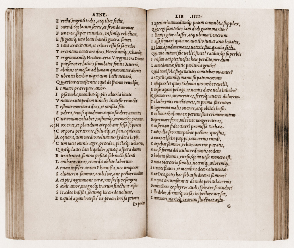
In letterpress printing a sort is a single piece of cast-metal type: say, a letter, a figure, or a punctuation mark. A compositor who was out of sorts had exhausted the supply of one or more characters needed to set a text. In hot metal setting, sorts were replaced by slugs – lines of metal type formed in the matrices of line-casting machines. After printing, the slugs could be recycled: thrown into the hellbox and melted down to be cast anew. With photocomposition and digital type, the sort and the slug were superseded by the disembodied and infinitely reproducible glyph. The only reason to be out of glyphs is by intention, a test Georges Perec set for himself in his novel La disparition, where the notional type-case was devoid of the letter ‘e’.
Something else that certain typographers would like to see thrown into the hellbox of history is leading. In a marginal note to his essay in Aspects of Contemporary Book Design the graphic designer Andrew Barker called for its retirement:
Oh please, not ‘leading’! Leading is only possible with metal type, and not only that, the term is misapplied in computer programs. Properly 10.5 pt leading is 10.5 in addition to the body size. So no, I won’t be using the term ‘leading’ unless I find myself talking about metal type. When working on a computer I shall refer to the baseline–baseline distance, a term that may be cumbersome, but it is at least unambiguous and accurate.
Barker’s hope of sidelining the anachronism has proved largely futile so far. Perhaps leading will go the way of stereotypes, clichés, sorts, slugs and hellboxes, but the archaic term, even if inexact, is still the most elegant available (as well as ‘baseline–baseline distance’ other clunkers one sees from time to time are ‘interlinear spacing’ and ‘linear increment’). The 10.5 pt example is technically correct, but for such a misunderstanding to be carried through to a job would require abject cluelessness.
In another tussle over leading, between editors and compositors, the printers came out on top. The printers’ lead (rhyming with dead) refers to strips of metal inserted between lines of type to space them vertically, the editors’ lead (rhyming with bead) to the opening paragraph of an article. In newspaper composing rooms where editors and compositors worked on the same copy in close quarters, the ambiguity had to be quashed. It was happily resolved: the printers got to keep their metal, and even post-line-casting, journalists use the slangier lede.
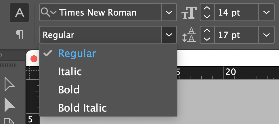
A word which, in one of its uses, is hanging on by the skin of its teeth is roman. This was often used to denote the most common, upright version of an old-style (generally speaking, serifed) typeface, and sometimes still does. In Linotype’s Janson and some of Matthew Carter’s designs, including Galliard and Miller Text, the weights intended for body text are called roman. Most digital typefaces now label such fonts either regular or normal. For one ubiquitous typeface this has prevented a troublesome tautology.

Italic is on firmer ground, even though if you think about it too much, the word’s derivation makes it rather vague. Its meaning, ‘of or pertaining to Italy’, could equally apply to roman type. A better designation might have been Venetian, for the city where Aldus Manutius commissioned Francesco Griffo to cut the earliest version of such type. But Venetian Old Style, also known as Humanist, has subsequently become one of the terms used to distinguish the roman fonts made before 1495 from later Garalde type, itself sometimes called French Old Face. To add to the confusion, some of the most admired and imitated Venetian Old Style type was created by Nicolas Jenson, a Frenchman. Let’s just lean into italic.

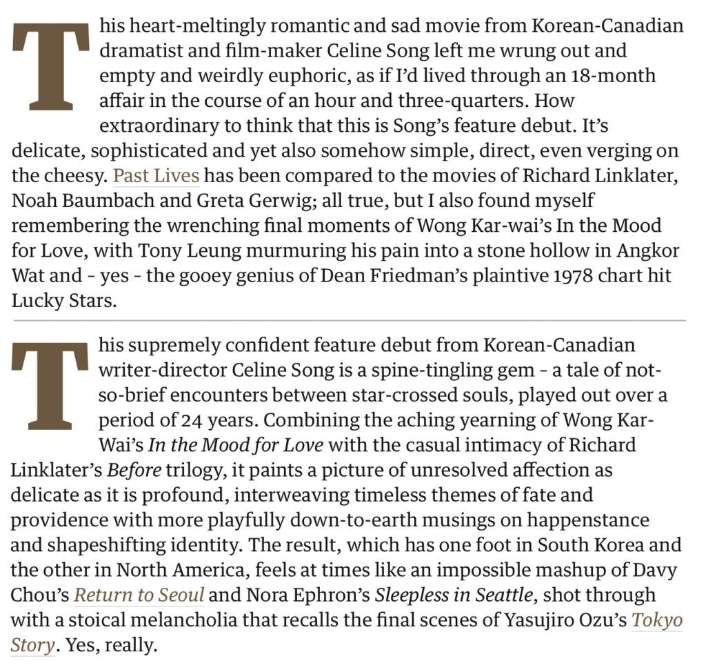
The approach H.W. Fowler prescribed for the use of italics, to ‘pull up the reader & tell him not to read heedlessly on’ seems to be declining a little. The New Yorker used to italicise titles, but now puts them in double quotation marks, reserving the style for emphasis and non-English words and phrases. The Guardian considers title case alone sufficient to distinguish the names of books, newspapers, plays and movies, although its sister Sunday title, the Observer, still prefers italics. The two newspapers share an online presence – theguardian.com – where the typography, identical for both titles, makes it easy to mistake which paper originally published an article. Below are the opening paragraphs of reviews of the same movie, by Peter Bradshaw in the Guardian, and by Mark Kermode in the Observer. The writers share a couple of exact comparisons and are in five-star critical consensus. The rival subeditors haven’t found as much common ground.
