We are herein presented to some five hundred thousand characters, each one deftly drawn in a line or two of agate type, each one standing out from the rest in bold relief.
Notes on the 1920 New York City telephone directory
Robert Benchley, ‘Of All Things’.
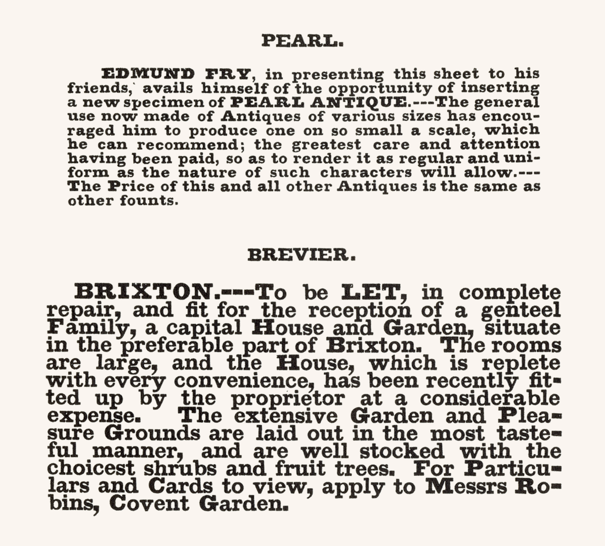
Before type was specified as being of a particular point size – say, 10-point Palatino; 8-point Univers – fonts were known by named sizes, generally agreed upon and understood within the printing trade. Outside of remaining letterpress printing offices, few of these names are now in general use. Typographic layouts are still sometimes specified in multiples of picas (a pica being 12 points, about a sixth of an inch) but one no longer hears 12-point type being referred to as pica. Robert Slimbach’s versatile typeface Minion is familiar to users of Adobe’s page layout app InDesign, for which it is the default typeface. But its name owes more to the sense of a typographer’s compliant factotum than the traditional designation of minion as 7-point type. Among other names of sizes which have largely lost their typographic sense are pearl (5 point) and brevier (8 point), both shown in the detail below, of ‘Antique’ type from Edmund Fry’s Specimen of Modern Printing Types (1828).
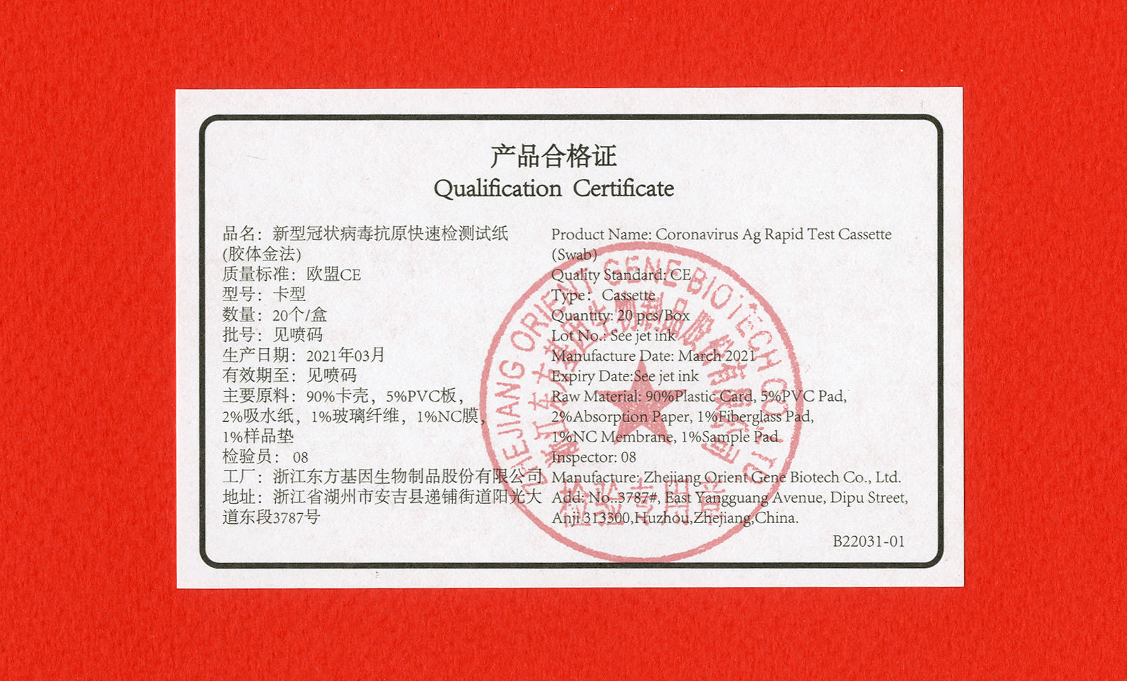
Falling between these two sizes is agate. Widely used in the United States, agate signifies type of about 5½ point, generally accepted as the smallest size to remain legible in hot metal printing on newsprint. In newspapers it has typically been used for text that might be of little interest to most readers, but of obsessive importance to specialist audiences (think stock prices, racetrack results, ballgame statistics). The word escaped the bounds of printing argot and entered the vocabulary as a synecdoche for small print, both where it might be useful (a city bus schedule, an optometrist’s eye-test sheet) and where it might be hiding something in plain-ish sight (onerous terms and conditions in a contract, alarming potential side-effects in a prescription drug leaflet). Sometimes, as with the coronavirus antigen test certificate shown here, it’s used for text that isn’t really expected to be read, printed solely for regulatory reasons.
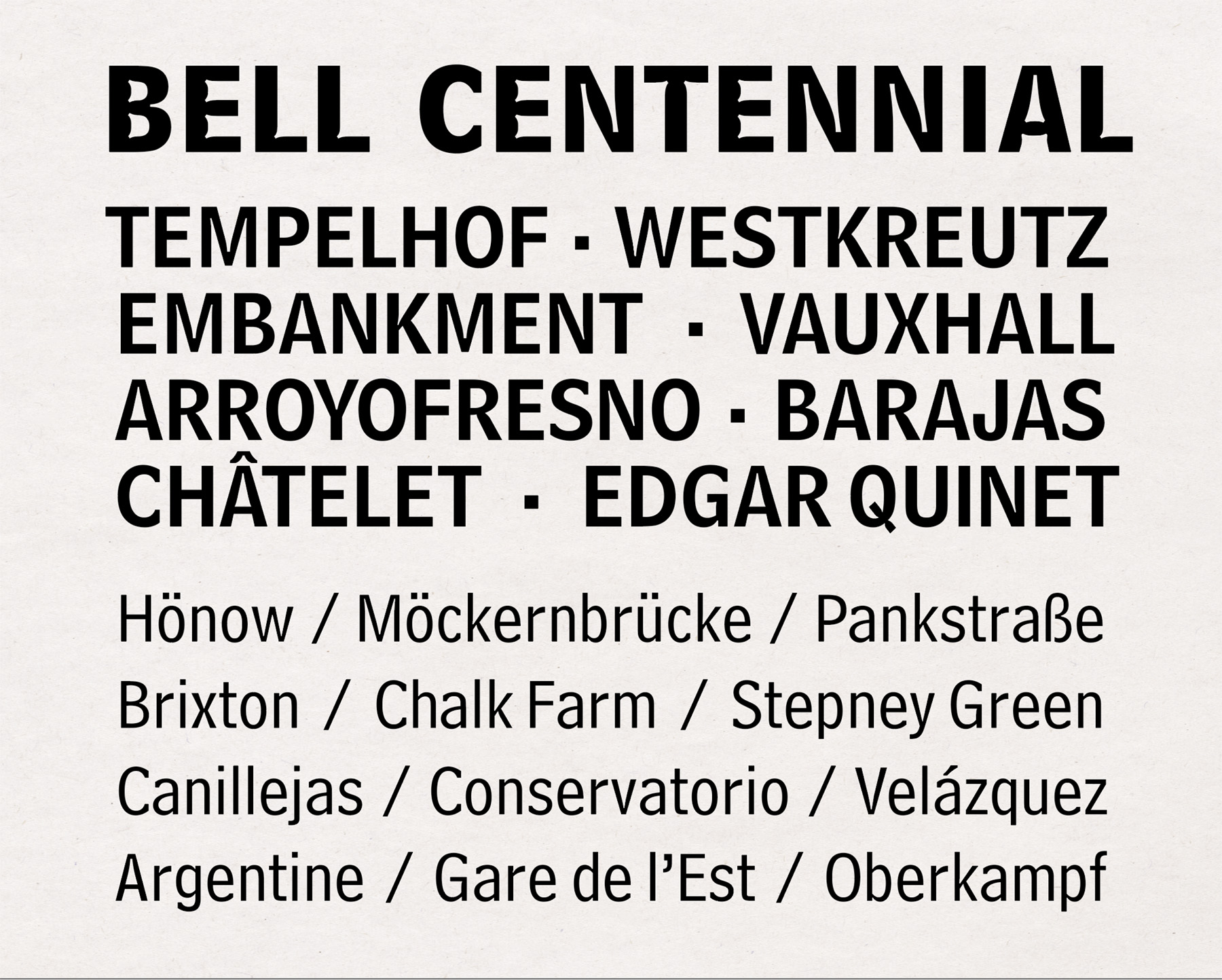
Robert Benchley’s introduction to the dramatis personae of the New York City telephone directory quoted above points to one of small type’s most useful 20th-century applications. Phone books, like newspapers, were printed in huge quantities using low-quality paper on fast presses. Later editions of the book that Benchley was having fun with were printed, from 1938, using Bell Gothic, a condensed sans-serif typeface designed by Chauncey H. Griffith, itself superseded in 1978 by Matthew Carter’s Bell Centennial. As well as being the designer of numerous interpretations of historic typefaces, Carter is known as one of the great typographic problem solvers (he led the design of Georgia, Tahoma and Verdana for Microsoft, typefaces which work nicely in print, but were designed with the limitations of PC displays in mind). Like Bell Gothic, Bell Centennial is condensed and economical in space, but the distinctive innovation was exceptionally deep indentations to de-emphasise the ‘ink traps’ – the junctions where parts of glyphs meet – which tend to overfill when printed in small sizes on cheap, porous paper.
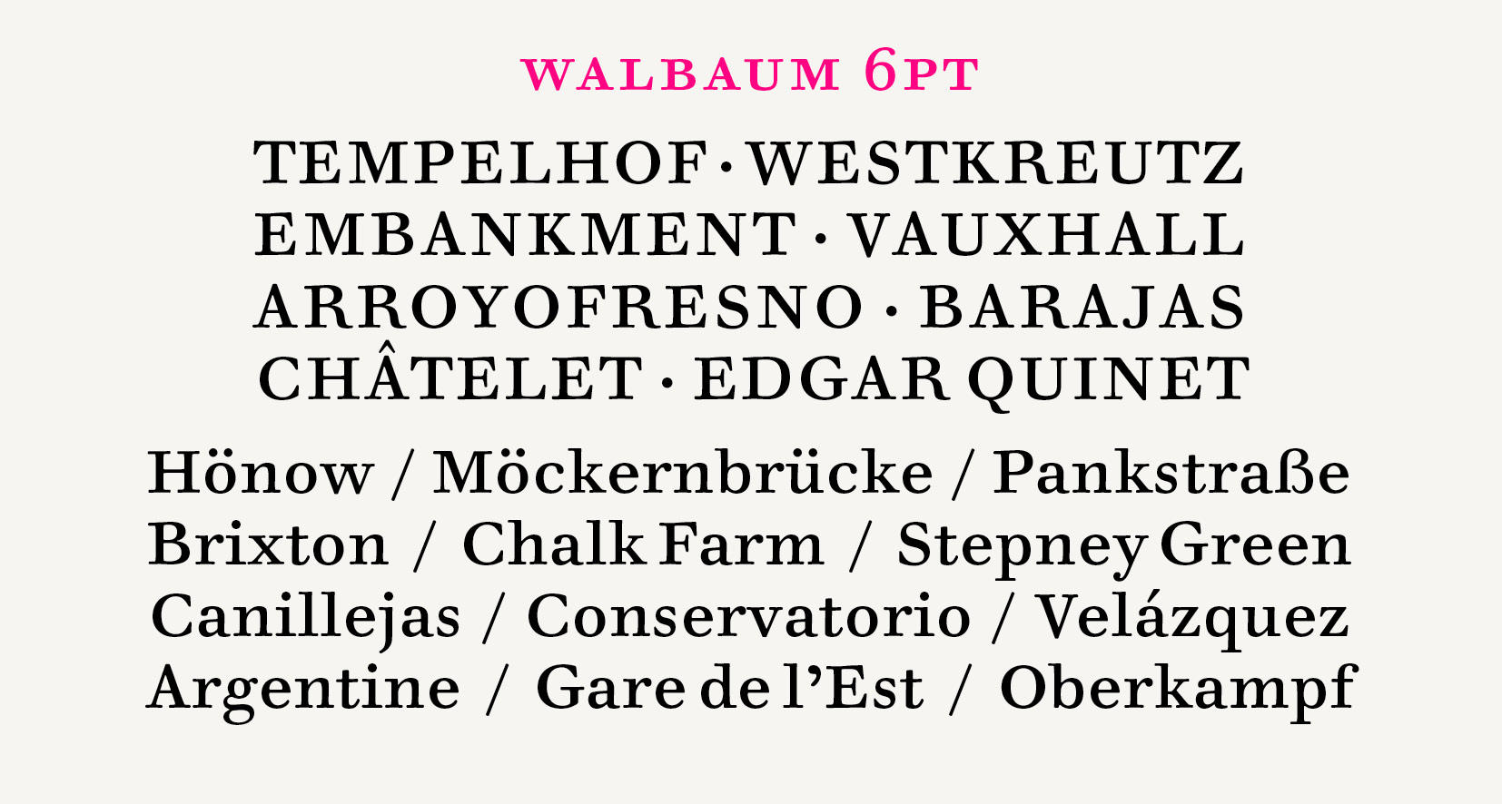
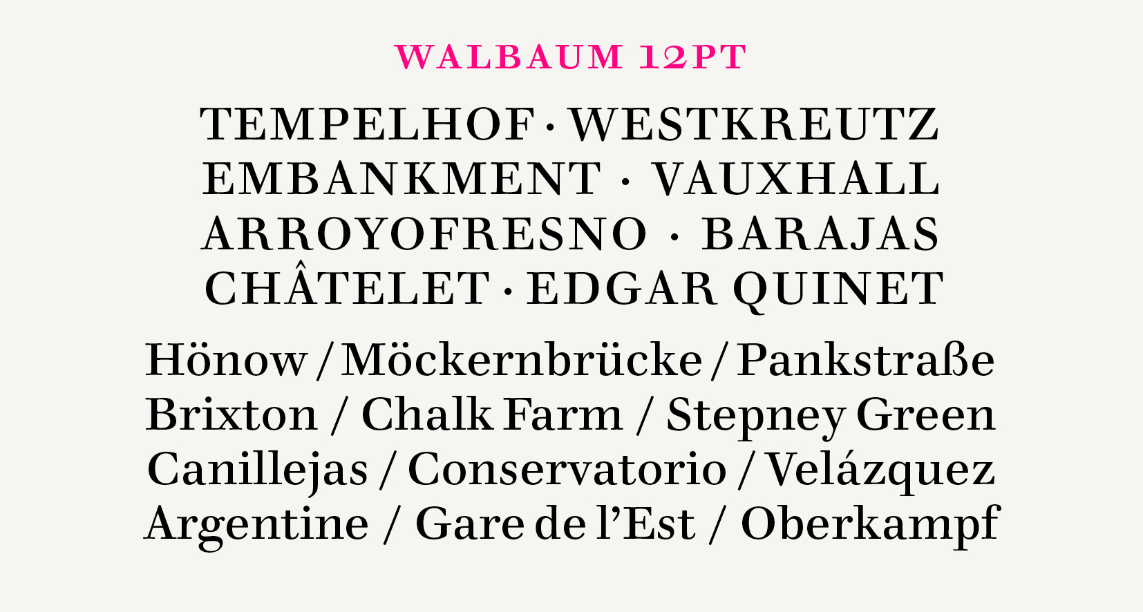
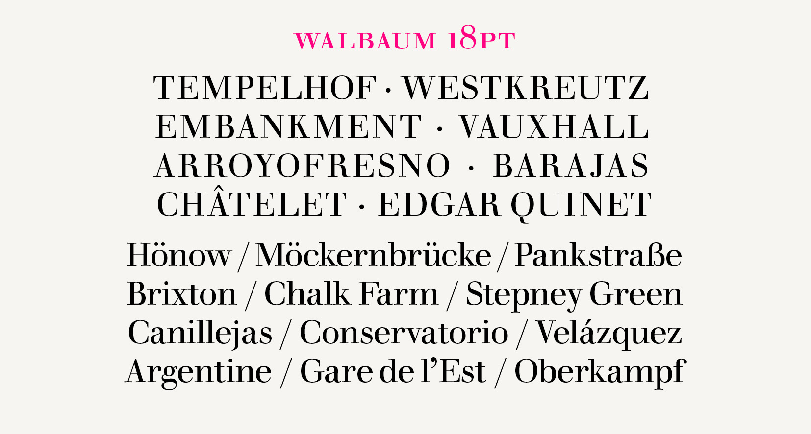
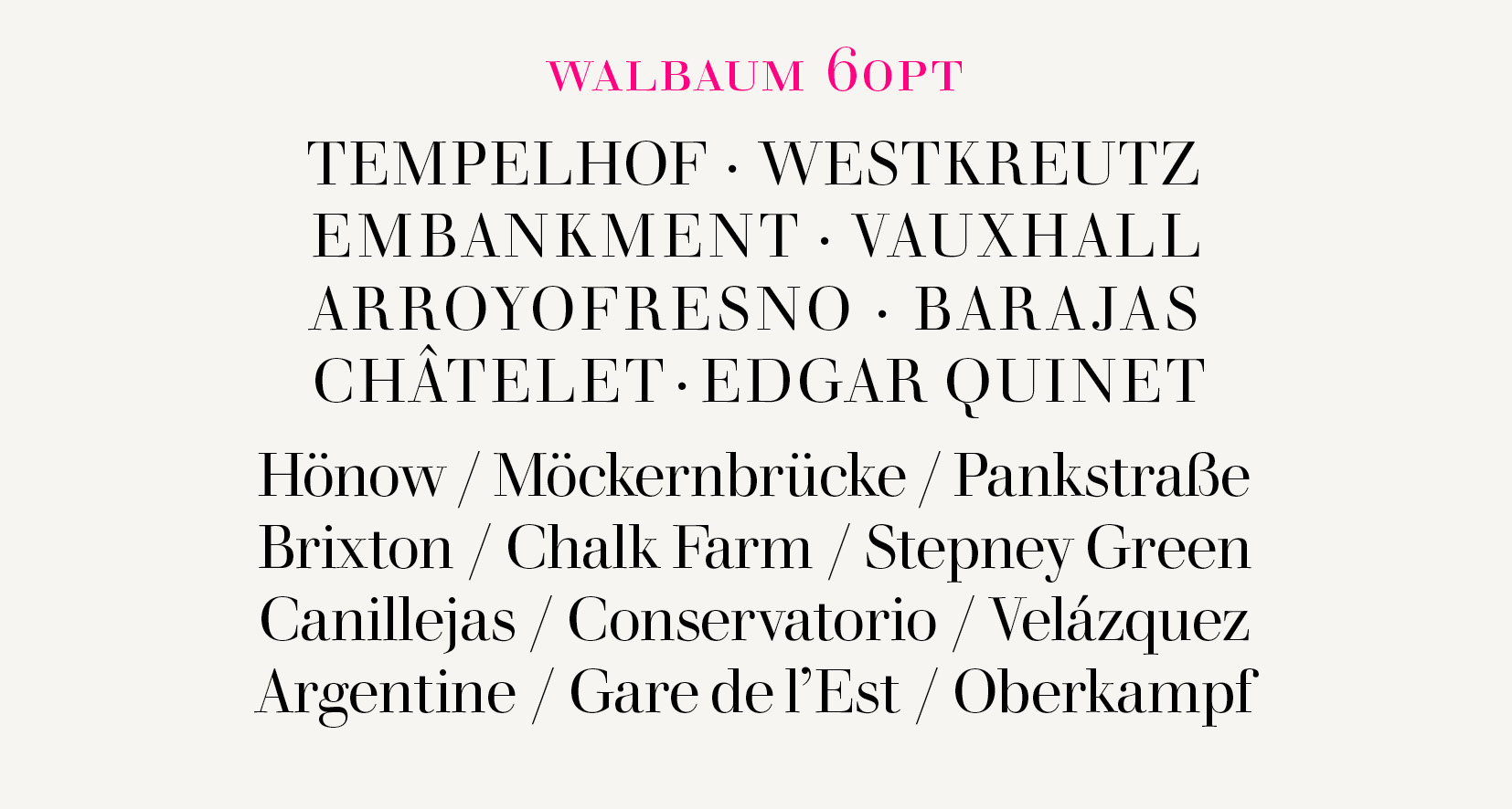
The subtleties of fonts of different sizes was usually lost in the transition from metal setting to photocomposition. Typefaces, which had consisted of multiple fonts, differently proportioned and spaced according to their size, began to be issued as single instances, optimised for where it was assumed they would be used. A display face, intended to be reproduced in large sizes for advertising or on the covers of books and magazines, might be made to look at its best at 36 points or larger. A general-purpose face intended for the body text of books and magazines, would be targeted at about a third of that size. And advances in the quality of offset printing made the design differences even more obvious when type was set at a non-optimal size. More recently some digital typefaces, like Monotype’s 2018 version of Walbaum shown here, have been issued in different ‘optical sizes’, as fonts sharing structural qualities, but adjusted for different contexts. The refined 60 point version (five-line pica under its old named size) intended for headlines, simply couldn’t do the same work at small sizes as the 6 point (nonpareil).
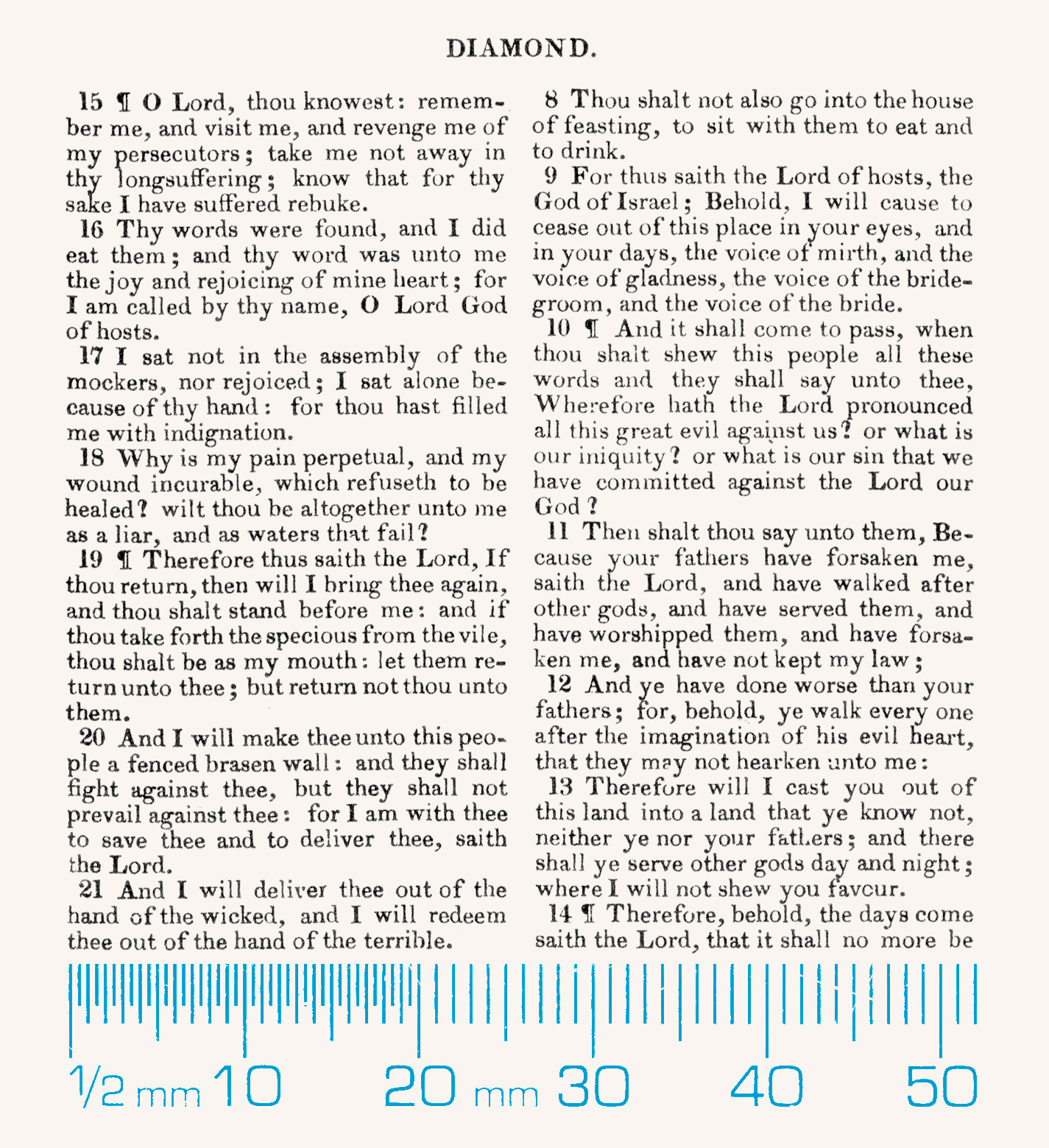
The smallest size included in Fry’s Specimen, shown with a superimposed millimetre scale below, diamond (4½ point) is uncomfortably small for anyone without exceptional eyesight or a magnifying glass. Other foundries issued even more minute fonts in sizes brilliant (4 point) and minikin (3 point) but the use cases for such text must have been minimal in every sense.
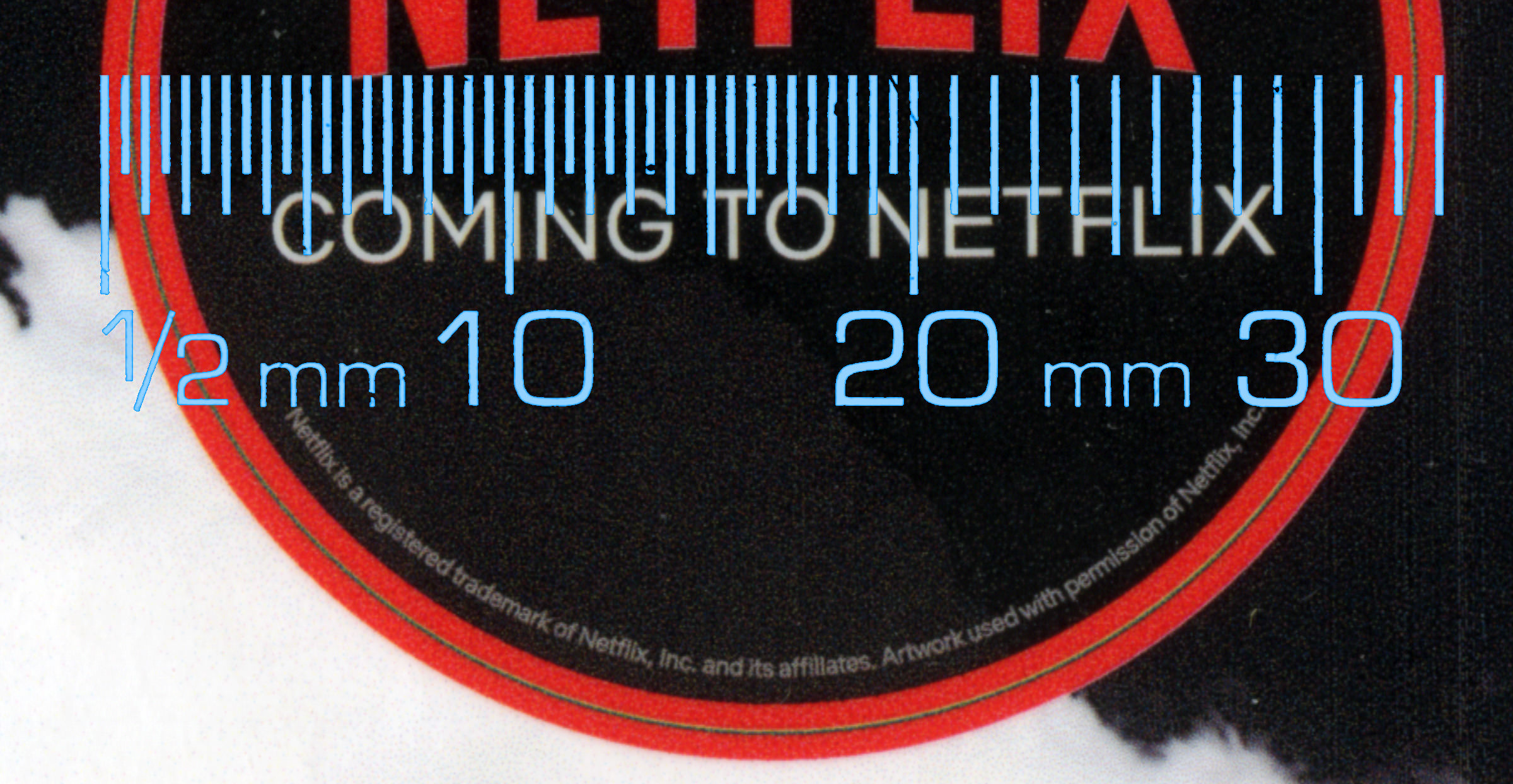
I have been reading The Power of the Dog by Thomas Savage in a paperback edition issued to coincide with the release of Jane Campion’s movie version of the book. Happily the cover doesn’t show an image of characters from the film (much better to do the casting in one’s mind), but uses a striking landscape photograph by Jay Wesler in a sympathetic design by Suzanne Dean. Less agreeably, the moody composition is interrupted by coming to netflix branding on a faux (i.e. printed, so unremovable) sticker.

At first I thought wavering white arc at the bottom of the Netflix roundel was a curious design element: perhaps a friendly smile? Looking closer, it was evident that it was text, but so small that even with a 4x loupe it wasn’t legible. A high-resolution scan revealed that the words, as might be expected, were there to protect the company’s trademark. The superimposed millimetre scale shows just how tiny the letters are, an indication of just how much detail is possible in modern printing, even with half-tone-grey-out-of-black text, a trickier proposition than solid black on white.
Two questions come to mind. When an expression of rights is made which is impossible to read without technological intervention, has that expression been made? And what size is the text? 2 point? 1½ point? Pointless?
¶ Sources. Specimen of Modern Printing Types by Edmund Fry (facsimile edition, Printing Historical Society, 1986); Of All Things by Robert Benchley (Henry Holt & Co., 1921); Traditional point-size names (Wikipedia); ‘The Little Font That Could’ by Dave McKenna (Defector, 5 April 2022); The Visual History of Type by Paul McNeil (Laurence King Publishing, 2017).